Thanks for this Crusade, Michelle! Not only do I need to use more text in my journal, but I really need to take the time to go through some of those magazines I've been saving to cut text and images out of!
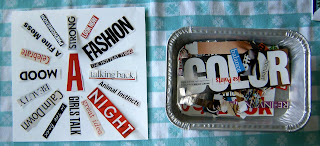
Here where I started:
I noticed alot of red and black in the text in the collection I had started. I decided since I don't use red alot I should play with red for a journal page. The big red "A" caught my attention. Since A is the beginning I though that would be a good start so put that in the middle of the page. I was going to say I didn't pick what words to use, but, since I was the one that went through magazine, and then the one to pick the words out, I did pick the words. But my main criteria in selecting these was color and the width and length. So above is my "test" layout.
Then I went to work on the background for the page, first - white gesso, then a strip of striped packaging tape.

The next step was to put some color down with acrylic paints. So I turned the journal on edge and applied some red acrylics and hit it with the spray bottle of water and let it run down the page. Soaked some up with paper towels and let it dry thoroughly. It was looking entirely too pink for my liking so I decided it needed some contrast. I used black acrlyic paints and a small bottle lid to add some circles.
Next I glued down my text with Golden Gel Medium. I forgot to take a photo at that point (it's hard to remember to take photos of all the steps along the way!) . But it still looked to me like it needed something so I took a black Sharpie and drew the circles and lines over the top.

I'm liking how it turned out, even if it is red and I'm not much of a red person! Thanks Michelle for inspiring me to step outside my norm! How cool is that?!?
Thanks everyone for taking a look!


Hey Kimber...
ReplyDeleteGreat RED journal page!!! Red is one of MY favorite colors & I love different kinds of text, so I'm really enjoying how your page turned out. Thanks for sharing it with us.
xo
Debbie
===^..^===
Wow Kim that looks great, love the radiating words. I played too!!
ReplyDeletenice work :)
ReplyDeleteThanks for visiting my blog. I hope my finished page looks half as good as yours, which is fabulous. The drawn circles bring the whole composition together. Brilliant!
ReplyDeleteI really like the visual that your words created. Awesome page...
ReplyDeleteThis is really unique looking. Great job. I love the energy from this. I haven't tried this yet but I have started to cut out text.
ReplyDeleteah ... I like how you displayed the words, original idea. Very nicely done!
ReplyDeleteVery cool visual! With the circles and lines moving outward the whole piece looks like it is spiriling.
ReplyDeleteA is for Awesome!!! LOVE seeing the initial layout, then how you amped it up with color and lines. I'm digging the RED big time! Very fun page Kimber, thanks for sharing with the team!!
ReplyDeleteLove the circular pattern you made. It looks, like Michelle said, awesome.
ReplyDeleteBeautiful! LOVE the red and the circle you've made.
ReplyDeleteStriped packing tape - I want some LOL. I love your final page; the red really works for me and I think the black Sharpie lines finish things off nicely.
ReplyDeleteOh, I really like how you did that in a circle! ; ^ ) lenna
ReplyDeleteThe circles are the perfect finishing touch. I'm reminded of a broadcast tower sending waves upon waves of conflicting messages to our brains. And I like the red!
ReplyDeleteBeautiful ! Thank you for sharing the process !
ReplyDeleteFantastic! I like how you have the words radiating out from the center.
ReplyDelete